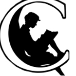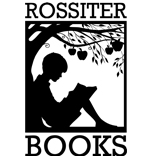
Their logo is, gratifyingly the most widely used logo that we have designed so far.
It is also one of the most adaptable, used in everything from bookmarks and advertising banners, to wax stamps, loyalty cards and bookends.
Take a look at the website here: www.rossiterbooks.co.uk
A lot of people ask us about the logo, and how it came about, so here is a quick description.
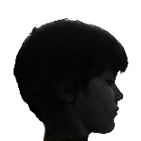
The idea started with an illustration we found in a book. I took a photo of my son, Oliver, cut out the shape of his head, and used the shape of the boy under the tree as the starting point.
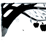
From there we painted a tree in silhouette, and added the font (Rockwell Bold) Then all that was needed was a few apples.